Key Takeaways
- Treat the healthcare site as a continuously instrumented service line rather than a redesign project, with weekly throughput, event-level KPIs, and a backlog ranked by modeled impact 1.
- Make online appointment scheduling the primary CTA on every service and location page, since it carries the cleanest evidence of both satisfaction lift and operational throughput 3.
- Allocate test budget against the UX dimensions with the largest marginal effect on satisfaction—responsiveness, communication clarity, and personalization—rather than spreading cycles evenly across surfaces 1, 11.
- Split test results by referral source, device, and service line so that health literacy, age, and education differences surface as conversion levers instead of being averaged away 4, 10.
The site is a service line, not a redesign project
A growth director inheriting a healthcare website usually finds the same artifact: a brochure built two years ago, a quarterly retainer paying for tweaks, and a Google Analytics property nobody trusts. The instinct is to commission a redesign. That instinct is wrong. A conversion optimization website is not a deliverable—it is an instrumented service line that runs continuously, the same way a paid media program or a sales pipeline does.
The 2025 BMC Health Services Research optimization model makes this concrete. Its authors treat patient experience as a multi-factor system where specific UX dimensions—responsiveness, communication clarity, personalization—carry different marginal effects on satisfaction, and where improving the highest-impact dimensions produces a substantial lift in overall scores 1. The implication for a growth team is that the site's value is set by how well it is measured and tuned against those dimensions, not by how it looked the day it shipped.
Redesign projects fail the operator test in three ways:
- They concentrate spend into a single launch event,
- they treat UX as a taste argument rather than a measurement problem, and
- they assume the population using the site is static.
Online health information research shows the opposite: users vary sharply by education, age, and health literacy, and those variables shape whether a CTA reads as credible or confusing 4. A site optimized for one segment can underperform for the next without anyone noticing until pipeline drops.
The reframe is structural. Treat the site as a service line with weekly throughput, KPIs at the conversion-event level, and a backlog ranked by modeled impact. The rest of this article works through what that looks like in practice.
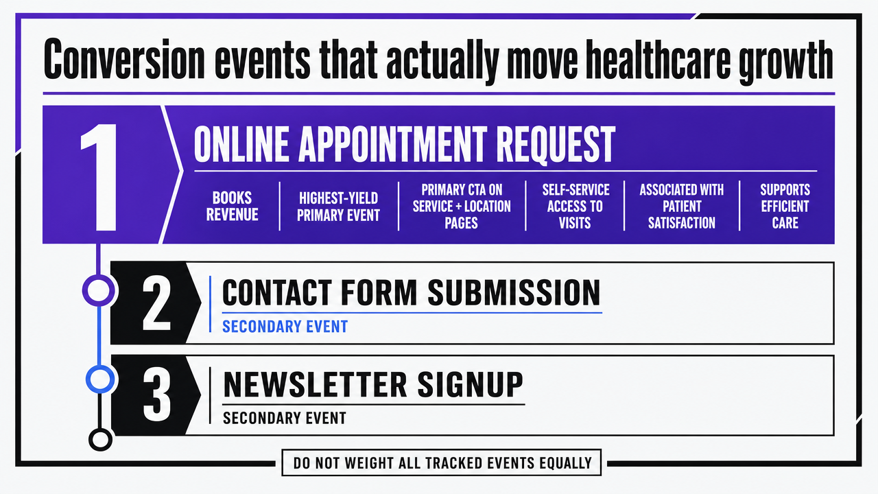
Conversion events that actually move healthcare growth
Online scheduling as the highest-yield primary event
Growth directors who audit a healthcare site's conversion mix often find a dozen tracked events and no hierarchy. Newsletter signups, contact form submissions, location lookups, and PDF downloads sit alongside the only event that actually books revenue: an online appointment request. Treating those events as equally weighted is the first analytics mistake. The second is failing to make scheduling the primary call to action on every page that ranks for service or location intent.
The 2025 Frontiers in Digital Health analysis is direct on this point. Online appointment scheduling increases patient satisfaction and supports more efficient care by giving patients flexible, self-service access to visits, with measurable associations between adoption and satisfaction scores 3, 12. Compared with portal enrollment—where systematic review evidence on clinical outcomes is mixed and inconsistent 2—and telehealth booking—where benefits are convenience-led and condition-dependent 7—scheduling carries the cleanest evidence of both experience lift and operational throughput.
That hierarchy has design consequences. A scheduling widget that loads below the fold on a service page, requires three pre-qualification questions before showing availability, or routes to a generic intake form is not a primary CTA. It is a deferred CTA dressed as a primary one. Sites that recover this hierarchy tend to do four things:
- surface real-time availability on the service page itself,
- expose location and provider filters without a page reload,
- preserve a phone fallback for users who abandon mid-flow, and
- instrument every step as a discrete event in GA4.
Scheduling is also where demographic friction shows up first. The same study notes that benefits may depend on patient demographics and digital literacy, which means a single scheduling flow optimized for the median user can suppress conversions among older or lower-literacy segments 3. Segmentation testing belongs here, not in a separate accessibility workstream.
Portal enrollment: necessary, insufficient, and often misread
Portal signups are the conversion event most likely to be miscounted as a win. A patient creates an account, the dashboard increments, and a quarterly report claims engagement is up. The systematic review evidence tells a more careful story. Digital patient portals can improve patient engagement and satisfaction, but evidence for improvements in health outcomes due to portal use remains inconsistent across studies 2. Enrollment is the entry event, not the value event.
The full-text JMIR review breaks this apart with useful granularity. Tabulated results show that several studies reported improved self-management and satisfaction among portal users, even when clinical outcomes were unchanged 8. Translated for a growth team: portal activation correlates with downstream engagement that does support retention and satisfaction KPIs, but only when measurement extends past the signup confirmation page. A site that ends portal instrumentation at account creation is reading a leading indicator as a result.
Two design implications follow:
- The conversion event worth optimizing is not portal account creation—it is the second login within thirty days, or the first completed task inside the portal (message sent, refill requested, record accessed).
- The funnel feeding portal enrollment matters as much as the form itself. Patients who arrive at signup via a vague "Patient Resources" link convert at different rates than those routed from a post-visit follow-up email, and the difference is not random.
Selection bias also complicates the read. The review flags that observed benefits may partly reflect characteristics of patients who choose to engage rather than the portal design itself 2. Growth teams analyzing portal performance against a comparison group should account for that before attributing lift to a UX change.
Telehealth booking as a convenience conversion
Telehealth sits in a different conversion category than scheduling or portal enrollment. The Cureus review frames it plainly: studies have shown that telehealth provides convenience, safety, and positive patient experiences across multiple contexts and conditions 7. The conversion argument on a healthcare site is therefore an experience argument first and an access argument second. Pages that lead with "see a clinician today from home" outperform pages that lead with eligibility caveats, even when the underlying service is identical.
The supporting evidence sharpens what kind of pages should carry the telehealth CTA. Several included studies show improved follow-up rates and patient-reported outcomes in telehealth contexts 13, which means follow-up visits, chronic condition check-ins, and behavioral health are the service lines where telehealth CTAs do real work. New-patient acquisition pages for procedural specialties are not the place to push a virtual visit; the conversion will be lower and the routing will create downstream friction.
Heterogeneity is the caveat. The same review notes that telehealth is not uniformly beneficial across all settings and patient groups 7. Operationally, that means a multi-location site should not force a single telehealth CTA across every service page. Mapping the CTA to service lines with documented telehealth benefit—and suppressing it on pages where in-person care is the standard—prevents the inflation of a metric that looks like a conversion but routes patients into the wrong channel.
 Visualize the evidence-based hierarchy of three primary conversion events discussed in this section, ranking them by strength of supporting evidence
Prioritizing UX dimensions by marginal impact
Most CRO backlogs are organized by what is easiest to ship, not by what is most likely to move the satisfaction or completion score. That ordering is the second analytics mistake after event hierarchy. The BMC 2025 optimization model offers a cleaner approach: rank UX dimensions by their modeled marginal effect on satisfaction, then spend test budget in that order 1. The authors are explicit that improvement of specific user experience factors can produce a substantial increase in overall satisfaction, which means the dimensions are not interchangeable and equal-weight prioritization wastes cycles 1.
The model's coefficient estimates make the spread visible. Responsiveness, communication clarity, and personalization carry significantly larger marginal effects on satisfaction than other dimensions in the framework, which translates directly into where a growth team should concentrate iteration work 11. A bar chart of those coefficients is the simplest planning artifact a CRO program can produce, because it converts a qualitative debate—"should we redesign navigation or rewrite the service pages?"—into a ranked queue with expected impact attached to each item.
What this looks like in a backlog: responsiveness work (page speed, time-to-interactive on scheduling widgets, real-time availability rendering) outranks personalization work (location detection, returning-visitor logic) on most healthcare sites, and both outrank cosmetic communication work (font choices, hero photography) by a wide margin. Communication clarity—plain-language service descriptions, jargon-free pre-visit instructions, unambiguous CTA labels—sits closer to the top than most design teams assume, because clarity feeds directly into the credibility evaluations that higher-literacy users perform before converting.
One caution applies. The BMC authors note that optimization parameters must be recalibrated to different health systems and populations rather than universally applied 1. A growth director running a multi-specialty group should not import another system's coefficient ranking wholesale. The method transfers; the weights do not. Re-running the prioritization model against the site's own satisfaction and completion data—quarterly, against fresh survey and behavioral inputs—is what keeps the queue aligned with the population actually converting.
The practical takeaway is operational, not philosophical. A site that ships ten tests a quarter against the top three dimensions will outperform a site that ships thirty tests scattered across every surface, because the marginal returns are not flat. Test budget is a finite resource. Allocate it where the model says the lift lives.
Test Conversion-Focused Content in Real Time
Launch live conversion experiments and analyze outcomes before making a long-term commitment.
Segmentation: health literacy, age, and education as conversion levers
Most healthcare CRO programs treat segmentation as an accessibility checkbox handled by a separate compliance review. That framing misreads the data. The systematic review on online health information seeking identifies education level, age, and health literacy as the key factors shaping how users find, evaluate, and act on health content online 4. Those are not equity variables sitting next to the funnel. They are inputs to the funnel itself, and they explain why a single conversion path produces uneven results across a multi-location patient base.
The behavioral pattern matters for test design. Higher-literacy users are more likely to evaluate the credibility of online information before acting, which means they engage with provider credentials, outcome data, and plain-language service descriptions before booking 10. Lower-literacy and older users lean more heavily on familiar sites, search engine cues, and visual hierarchy, which means navigation labels, page scent, and CTA prominence carry disproportionate weight in their decision to convert 4. A scheduling page tuned to one of those groups will underperform for the other, and a site-wide A/B test that averages across both will show flat results even when meaningful sub-segment lifts exist.
Practically, this turns segmentation into a testing protocol rather than a content audit. Splitting test results by referral source (organic search vs. paid social vs. direct), by device class, and by service line approximates the demographic spread well enough to surface where a variant helped one segment and hurt another. Sites that skip this analysis routinely ship changes that improve aggregate scheduling completion by a point or two while suppressing conversions among the older patient base that drives higher-margin service lines.
The equity caveat travels with the analysis. The review flags that low health literacy and limited digital skills can hinder safe and effective use of online health information, which is the conversion-side version of the same problem—patients who cannot complete a digital scheduling flow do not convert at all, they simply drop into the phone queue or leave 4. Maintaining a visible phone fallback, plain-language CTA labels, and a credentialed-author byline on service pages is not a concession to a minority of users. It is a conversion design choice that the literature supports for the segments most likely to abandon a friction-heavy flow.
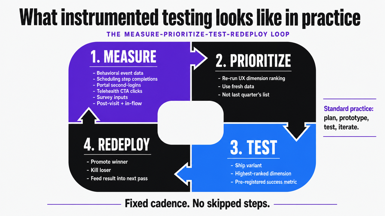
What instrumented testing looks like in practice
The measure-prioritize-test-redeploy loop
The loop is four steps, run on a fixed cadence, and the discipline is refusing to skip any of them.
- Measure means continuous capture of behavioral data at the event level—scheduling step completions, portal second-logins, telehealth CTA clicks—paired with periodic satisfaction inputs collected through post-visit surveys or in-flow micro-surveys.
- Prioritize means re-running the UX dimension ranking against fresh data, not relying on last quarter's coefficient list.
- Test means shipping a variant against the highest-ranked dimension with a pre-registered success metric.
- Redeploy means promoting the winner, killing the loser, and feeding the result back into the next prioritization pass.
Usability.gov frames this as the standard government practice for designing usable sites: plan, prototype, test, and measure trends and demographics for continuous improvement 6. The framework is not novel. What is novel for most healthcare growth programs is running it on a sub-quarterly cadence instead of treating the four steps as project phases that happen once.
Two operational details separate loops that produce lift from loops that produce activity:
- The prioritization step needs its own artifact—a ranked queue with modeled impact attached to each item, rebuilt monthly, rather than a backlog ordered by ticket age 1.
- The test step needs a stopping rule defined before launch: minimum sample, minimum detectable effect, and a hard date. Tests that run "until we see something" do not produce learnings. They produce post-hoc narratives.
Avoiding the buried-CTA failure mode
The state public health usability assessment is worth reading as a catalog of what not to do. Reviewers documented multiple cases where critical information was buried several clicks deep or labeled in technical jargon that hid the action users came to take 9. The pattern recurs on commercial healthcare sites: a service page that requires three clicks to reach the scheduling widget, a portal entry labeled "Patient Resources," or a telehealth CTA tucked under an "About Our Services" submenu.
The same study found that many state sites did not conform to basic usability heuristics, producing friction even when the underlying information existed 5. The conversion-side translation is straightforward. A CTA that exists is not a CTA that converts. Three checks catch most buried-CTA failures before they ship:
- Click-depth from the highest-traffic landing pages to the primary scheduling event,
- Label clarity audited against plain-language standards rather than internal taxonomy, and
- Visual hierarchy testing on mobile where roughly half the traffic lands.
Sites that pass those checks still need ongoing surveillance. Navigation drift happens when product teams add new service lines and bury the existing CTAs to make room. Quarterly click-depth audits, scoped to the top twenty landing pages per location, surface the regression before it shows up in scheduling completion numbers.
 Visualize the four-step continuous loop described in the section as the operating cadence of a conversion optimization website
See How Leading SaaS Teams Streamline Conversion Optimization at Scale
Request a walkthrough of AI-driven workflows that automate content and PPC execution—eliminating agency bottlenecks for complex, multi-location or multi-product sites.
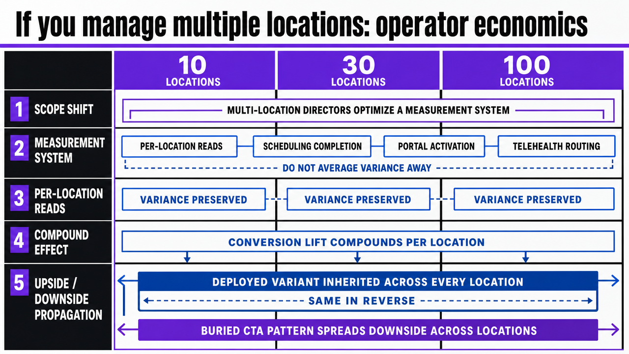
If you manage multiple locations: operator economics
Scope shift: the framing above applies to any growth program, but the economics break differently for operators running ten, thirty, or a hundred service locations under one brand. Multi-location directors are not optimizing a website—they are optimizing a measurement system that has to produce per-location reads on scheduling completion, portal activation, and telehealth routing without averaging the variance away.
The first economic reality is that conversion lift compounds per location. A scheduling flow improvement validated against the modeled UX dimensions 1does not produce a single percentage gain on a single property; it produces that gain across every location that inherits the deployed variant. The same is true in the other direction. A buried CTA pattern documented in the state public health usability assessment 9does not fail once—it fails every time a new location page inherits the template. Template-level fixes are the unit of work, and the return scales with footprint.
The second reality is that the per-location billing model most retainer agencies use does not fit this work. Charging by location for a fix that ships once is an artifact of agency staffing, not a reflection of where the value sits. Account-level execution—one prioritization queue, one test calendar, one deployment pipeline applied across every location—matches the actual unit economics.
The comparison below uses variables for retainer and in-house models because supplied research does not include agency dollar figures. The automated row reflects Vectoron's published post-trial rate of $599/month. Value-side anchors come from sourced behavioral evidence on scheduling satisfaction and utilization 3and modeled UX dimension impact 1, not invented conversion percentages.
| Model | Cost structure | Scales with locations? | Evidence anchor |
|---|---|---|---|
| Traditional CRO retainer | $Z monthly retainer + per-location billing across X locations and Y service lines | Yes, linearly | Scheduling satisfaction and utilization lift 3 |
| In-house CRO hire | Loaded salary + testing tools + analyst time, fixed regardless of X locations | No, but capacity capped by headcount | UX dimension prioritization 1 |
| Account-level automated execution | $599/month post-trial, one account covering all locations and service lines | No, flat across footprint | Continuous measurement and re-prioritization 1, 6 |
The operator question is not which model is cheapest in absolute terms. It is which model lets the prioritization queue, test calendar, and deployment loop run at a cadence that produces lift faster than the footprint adds new locations. Retainer arithmetic gets harder as X grows. Account-level execution does not.
 Visualize the three-model comparison table from this section in a more scannable format for multi-location operators
Staffing the work: retainer, in-house, or automated execution
The staffing question follows from the work itself. A continuous loop—measure, prioritize by modeled impact, test, redeploy—needs a team configuration that can run weekly, not a vendor relationship that ships quarterly. Three models cover the field, and each one fails differently.
Retainer agencies struggle with cadence. The work that produces lift is the dimension prioritization step 1and the stopping-rule discipline on tests, both of which require account-level data access on a daily basis. Retainer engagements priced by deliverable count tend to skip the prioritization step because it produces no shippable artifact, and they stretch test windows because longer tests bill more hours. Growth directors who have run this model usually recognize the pattern: the deck is polished, the queue is ordered by what the agency can produce, and the satisfaction-side measurement loop never closes.
In-house CRO functions solve the cadence problem and create a capacity ceiling. A single analyst can run the Usability.gov plan-prototype-test-measure cycle 6across a handful of templates, but the headcount math breaks at multi-location scale. Each new service line adds a backlog the existing analyst absorbs, and the prioritization queue degrades into whatever the loudest stakeholder requested last week.
Automated execution at the account level changes which work is human and which is not. Dimension ranking, click-depth audits, test sample calculations, and variant deployment across location templates run continuously without adding headcount. The human work moves up the stack: approving the prioritization queue, sanity-checking variants against clinical accuracy, and reading segmented results 4. For multi-location operators, Vectoron is built around that division of labor.
Frequently Asked Questions
References
- 1.Improving the healthcare user experience: an optimization model to increase satisfaction with health services.
- 2.The Impact of Digital Patient Portals on Health Outcomes, System Efficiency, and Patient Attitudes: Updated Systematic Review.
- 3.Efficient patient care in the digital age: impact of online appointment scheduling on health service utilization and patient satisfaction.
- 4.Online Health Information Seeking Behavior: A Systematic Review.
- 5.Usability of state public health department websites for communicating COVID-19 information to the public.
- 6.Usability.gov.
- 7.The Impact of Telehealth Adoption on Patient Outcomes.
- 8.Supplementary PDF: The Impact of Digital Patient Portals on Health Outcomes, System Efficiency, and Patient Attitudes.
- 9.Supplementary PDF: Usability of state public health department websites for communicating COVID-19 information.
- 10.PDF: Online Health Information Seeking Behavior: A Systematic Review.
- 11.PDF: Improving the healthcare user experience: an optimization model.
- 12.PDF: Efficient patient care in the digital age: impact of online appointment scheduling.
- 13.PDF: The Impact of Telehealth Adoption on Patient Outcomes.